Have you seen the new UI?
DesignerNew features 🎉
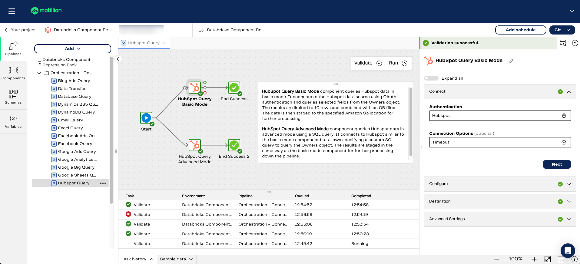
The Designer's new UI launched this week, with changes that enable easier configuration of components in a new, vertical panel. The redesign also features a more economical use of real estate, with access to panels on an as-needed basis. The component configuration panel appears when a component is selected or added to the canvas. The Pipelines, Components, Schemas, and Variables panels are out of the way until you click to expand them outward.
"The previous layout presented a significant user experience challenge due to limited vertical space for the component configuration panel. This often resulted in hidden parameters and wasted time spent resizing the panel. The new design addresses this by providing ample vertical space, complete with an intuitive scroll to accommodate complex configurations. This, in turn, allows for a dedicated and easily accessible Sample data tab at the bottom."
— Amie Wilson, Senior Product Designer at Matillion
Plus… the Query Result to Grid component is here!
Now in public preview, the Query Result To Grid component allows you to query a table and return rows of data that are loaded into a predefined grid variable for use elsewhere in the pipeline. You can set up a simple query via the component interface, or write your own SQL query.
This component is the grid equivalent of the Query Result To Scalar component.
The Query Result To Grid component is enabled initially for Snowflake and Redshift warehouses.
And more connectors!
We're happy to also announce the following new Flex connectors for developing data pipelines:
You can edit these Flex connectors through the Custom Connector feature to add your own endpoints and more.
We've also added Azure Blob Storage as a source and target for the Data Transfer component.