Designer UI basics🔗
All work in Designer is accomplished by pipelines, and these pipelines are created, configured, and managed through the main Designer user interface (UI).
To open the Designer UI and create your first pipeline:
- In the left navigation, click the Projects icon
 .
. - Select your project.
- Select your branch. Designer will open.
- Get started by creating a pipeline. Click the Orchestration pipeline tile, which is the recommended first step, or the Transformation pipeline tile. For more information, read Pipelines.
The Designer UI has several different elements, illustrated below:
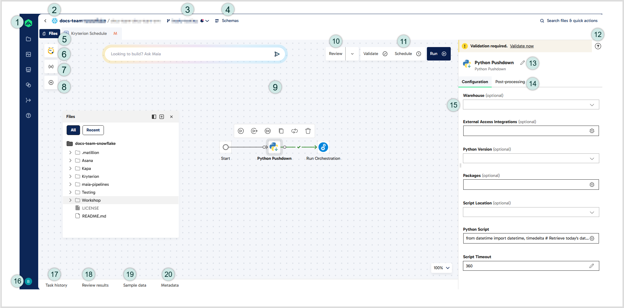
This image identifies the elements of the Designer UI, numbered as follows and described in detail in the following sections:
- Matillion icon: Click this icon to return to the Data Productivity Cloud homepage.
- Project bar: Displays an icon that indicates the data warehouse being used in the current project, followed by the project name, the current environment, and the current branch. Click the project name to go to the project details screen.
- Branch: This shows the name of your current branch. Click the branch name to open a drop-down menu with available Git actions features.
- Schemas: Click here to open the Schemas panel, which displays the table and view objects within your database. The Schemas panel is displayed in the same way as the Files panel.
- Files: Click here to open the Files panel, which is shown on the canvas in this example. The Files panel lists all folders and pipelines in your current branch and allows you to create new pipelines.
- Maia: Click this icon to chat with Maia, your agentic data team.
- Manage variables: Click this icon to create and manage two types of variable: pipeline variables and project variables. To learn more about variables in Designer, read Variables.
- Add component: Click this icon to open the Add component dialog, which lists all components that can be used in the pipeline.
- Canvas: The canvas is the area where components are assembled into pipelines.
- Review: Click Review to check whether your pipeline meets a set of predefined rules. For more information, read Reviewing pipeline quality.
- Pipeline actions: Use these buttons to validate, schedule, and run the open pipeline. For more details about scheduling pipelines, read Schedules.
- Help button: When you select a component, click the question mark icon to open the component documentation in a new browser tab.
- Properties: When you select a component, the Properties panel displays the component's configurable properties. Properties are displayed in collapsed sections, which you click to expand. By default, the Properties panel opens on the Configuration tab, which contains the Connect, Configure, Destination, and Advanced settings sections.
- Component name: Click the pencil icon to edit the component name that appears on the canvas.
- Post-processing: Click this tab to update user-defined pipeline variables and project variables via component execution. For more information, read Post-processing.
- Profile & Account icon: Click here to view and manage your account details, switch to a different account, or log out of your user account.
- Task history: When a pipeline runs, the Task history tab displays messages relating to the success or failure of the pipeline.
- Review results: After clicking the Review button on the canvas, click this tab to display the results of the pipeline quality review.
- Sample data: The Sample data tab displays data from validated transformation components.
- Metadata: Click the Metadata tab to view the metadata about the output of a component.
Different panels in the Designer UI can be expanded or contracted as required, so you can see more or less detail in a particular panel. Click on the edge of a panel, or the dividing line between any two panels and drag up/down or left/right, as required. Note that this change won't persist after you leave the Designer UI; it will always reopen with the default spacing.
Files panel🔗
The Files panel lists every pipeline you have created on your current branch. Icons identify the type of pipeline: a blue O for orchestration, green T for transformation. Pipelines can be organized into folders within the panel. Click Files in the top-left of the canvas to open this panel. If you have any files open, the Files button appears to the left of the tabs. You can also search for files using the search bar in this panel.
Click and drag the header of the Files panel to move it around the canvas, or click the Dock to left icon to dock it on the left of the canvas. If you use this option to dock the Files panel, the Schemas panel will also be docked. To undock the panel, click the icon again.
In this panel, you can add, delete, or edit pipelines. Read Pipelines for a full description of how to manage pipelines and use them in data workflows.
Our Pipelines tutorial is a step-by-step walkthrough that explains how to create an orchestration pipeline and a transformation pipeline using sample data provided by Matillion. This guide may be useful if you are new to Designer and want to practice creating pipelines and configuring components.
Uncommitted change indicators🔗
The Files panel displays indicators next to the name of a pipeline if it has uncommitted changes:
- N – The pipeline is new.
- M – The pipeline has been modified.
- R – The pipeline has been renamed but no other changes have been made.
Note
Deleted pipelines won't be displayed in the Files panel but will be listed in the Changes table in the Commit dialog.
These indicators help you quickly identify changes that you have made but not yet committed.
Add component🔗
When you have a pipeline open on the canvas, click the Add component dialog to see a list of all the components available to use in that pipeline. Each component is listed with a unique icon, which is the icon that will represent the component when it is added to the canvas.
The Add component dialog only shows the components that can be used in the type of pipeline currently open. For example, Create Table is an orchestration component and can only be added to orchestration pipelines, never to transformation pipelines, and so is only visible in the Add component dialog when you have an orchestration pipeline open. To locate a specific component, type any part of its name into the Search bar.
You can also click the Add component icon to add data from your warehouse directly onto the canvas. This creates a Table Input component for transformation pipelines.
Components are listed alphabetically and include a descriptor keyword, e.g. "Connectors" or "Flow". You can use these descriptors to filter out components that don't match that keyword. For example, typing "flow" in the search bar will return only the Flow components (And, End Failure, End Success, If, Or, Retry, Restart). The search also includes a number of synonym keywords to help filter components. For example, typing "logic" into the search bar will also return the Flow components.
To add a component to the pipeline, simply click it from the list in the Add component dialog. You can then drag it to any position on the canvas and connect it to existing components. Alternatively, you can add a component by clicking the small + icon that appears to the right of any component already on the canvas, and selecting the required component in the Add component dialog. Components added in this way are already connected to the existing component.
You can also add iterators to components from the Add component dialog. Search for and click the iterator you want to use, then use the connection ring beneath the iterator to connect it to the component you want to iterate. For more information, read Attaching, stacking and detaching iterators.
The pipeline canvas🔗
The canvas is the main area of the UI which displays the details of a pipeline. A pipeline is a collection of connected components, displayed as labelled icons on the canvas. To add a component to a pipeline, you can use either of the following methods:
- Click the Add component icon on the left of the canvas, then search for and click the component you want to add.
- Click the small + icon that appears next to any component already on the canvas to open the Add component dialog.
The following features apply, depending on whether you add a component using the Add component icon or the small + icon to the right of an existing component:
| Add component icon | Small + icon |
|---|---|
| Components are listed alphabetically. | Components are listed alphabetically. |
| Descriptor and synonym keywords help you refine your search. | Descriptor and synonym keywords help you refine your search. |
| The new component becomes the selected component and its Properties panel opens on the right of the canvas. | The new component becomes the selected component and its Properties panel opens on the right of the canvas. |
| The new component will not be connected to any existing components. | The new component will be connected to the previously selected component. |
| Choose the output connection between the previous component and the new component after adding the new component to the canvas. | Choose the Output Connection between the previous component and the new component in the Add component dialog. |
For more details about constructing pipelines from components, read Components overview.
Any change you make to a pipeline on the canvas, such as adding, deleting or moving a component, is saved automatically. However, you need to commit and merge the changes before you can publish the pipeline for use in schedules.
You can open multiple pipelines at once. Each is shown as a separate tab at the top of the canvas, and you can click a tab to quickly switch to viewing a different pipeline. You can reorder your tabs by selecting and dragging a tab to your preferred order. Clicking the X on a tab will close that particular pipeline.
In the bottom-right, there are a number of tools in the control box that let you change how you view the canvas. These tools are useful if you have a large pipeline that doesn't fit in the default canvas view:
- Click the - button in the zoom toolbar to zoom in, or + to zoom out, in increments of 25%.
- Click the Fit all button to resize the canvas view, and show all components in the pipeline.
- Scroll the entire canvas in any direction. Click on an empty area of the canvas and drag up, down, left, or right.
- The Enable snap to grid feature is disabled by default. While enabled, components will always be positioned within the canvas grid. While disabled, components can be positioned freely.
- Drag the dividing lines between the canvas and the surrounding panels, to reduce the size of those panels and allow more room for the canvas.
Note
Click the "i" button in the bottom-right to open Designer overview on the documentation website for guidance and support.
None of these changes will persist after you leave the Designer UI; it will always reopen with the default view.
The control box in the top-right of the canvas gives additional controls which you can use to Validate or Run the pipeline.
Canvas context menu🔗
As well as creating and configuring the pipeline, there are additional actions you can perform from the pipeline canvas. Right-click a blank place on the canvas to reveal the context menu. Refer to the table below for more information:
| Function | Description |
|---|---|
| Validate pipeline | Validate the pipeline. This performs a "dry run" of the pipeline, verifying that the pipeline will run without actually performing any data manipulation. |
| Run pipeline | Run the pipeline. |
| Add note | Adds a note box to the canvas. |
| Add note using AI | Invoke generative AI to annotate your data pipelines. Read AI Note for details. |
| Undo | Undo the last action performed. Actions that can be undone include deleting components, moving components, adding new components to the canvas, and connecting or disconnecting components. |
| Redo | Reverses the last Undo command, reverting whatever change was undone. |
| Copy | Copies any component, allowing you to then paste a copy of it. To perform this action, click the component to highlight it before opening the canvas context menu. |
| Paste | Paste a copy of a copied component at the location you have right-clicked. The copied component is identical to the original, including all configured properties. The Name will be slightly modified, and can be changed as normal. To perform this action, you must have first used the Copy action on a component. |
| Delete component | Remove a component from the pipeline canvas. To perform this action, click the component to highlight it before opening the canvas context menu. |
Component action bar🔗
The component action bar allows you to perform additional actions on a single component in the pipeline. Click a component to show the component action bar. The table below lists all the additional actions available on the component action bar:
| Function | Description |
|---|---|
| Run only component | Orchestration pipelines only. Runs only the selected component, not the entire pipeline. For example, running a query component will perform the query but will not perform any downstream processing on the results. In some cases, running a single component in isolation will be meaningless. For example, running an If component without running the part of the pipeline that provides the inputs to the If. The context menu won't include this option in these cases. |
| Run from component | Orchestration pipelines only. Runs the current pipeline starting from the selected component. This may be useful to test the downstream effects of amending the pipeline at a specific point, for example. As the full pipeline is not running, this action may produce unexpected results and so should be used with care. |
| Skip on run | Temporarily disables the selected component, allowing you to run the pipeline as if this component was not present. When a component is skipped, this action changes to Unskip on run. |
| Copy | Copies the component, allowing you to then paste a copy of it using the Paste action from the canvas context menu. |
| Iterate | Opens the Add iterator dialog, where you can choose an iterator to add to the selected component. For more information, read Attaching, stacking, and detaching iterators. |
| Delete | Remove the component from the pipeline canvas. |
Adding notes🔗
You can add any number of text notes to a pipeline canvas. These have no effect on the design or operation of the pipeline, but can be used to provide information for other users, such as the purpose of the pipeline.
Types of notes you can add:
- Text note - A freeform text box you write manually. To add a text note, right-click on the canvas, and select Add note from the context menu.
- Maia note - An AI-generated note created with Maia, Matillion's agentic AI. To add a Maia note, right-click a component (or multiple components) and select Add note using Maia. You can refine or regenerate the note as required. Refer AI Note (Maia) for more details.
A note is a text box with a solid outline. Click anywhere in the center of the note box to begin typing text. Text is aligned to the top-left of the box. You can format the text using common Markdown formatting. See this Markdown reference for details.
To write text on multiple lines, insert two line breaks (press Enter twice) where you want a blank line to appear between paragraphs.
Example:
First Line of text.

Second line of text.
Click and drag the border of the box to resize it. Click inside the border and drag to move the box around the canvas. Click inside the box and then click the square button above the box to change the box's background color. Click inside the box and then click the trashcan button to delete the note.
The note box sits behind components on the canvas, so if you drag it over components it won't obscure them but will appear as a colored background and a solid border around those components. This allows you to position the box around a particular group of components, for example, and type a note relating to that group.
Properties panel🔗
Every component has properties that can be configured to tailor the component's behavior. When a component is selected on the canvas, its properties are displayed in the Properties panel to the right of the canvas. A component's properties are described in the documentation for each component.
Note
For Public Preview only. Where Post-processing is available on a component, all properties will be displayed in the Configuration tab, next to the Post-processing tab.
The Properties panel shows the name of the selected component at the top, with a pencil icon next to it for editing purposes, the property names in bold, and the values of the properties underneath.
Toggle on Expand all underneath the name of the selected component to expand all headers and display all available properties. This toggle is off by default. Alternatively, click any header in the Properties panel to expand or collapse the corresponding properties.
To set or change the value of a property, click the button at the right of the value field. The type of icon tells you how you will set the value:
- Pencil: Type a value directly into the value field. Used for simple string and numeric properties.
- Down-arrow: Select a value from a drop-down list.
- Cog: Opens a dialog in which you can enter or select property values.
Note
Click the "?" button in the top-right of the properties panel to view the selected component's online documentation in a new browser tab.
There are two ways you can sample the data of a validated pipeline:
- Click the Sample data button next to the "?" button at the top of the Properties panel.
- Use the Sample data tab at the bottom of Designer. For more information, read Sampling output.
Task history🔗
Tasks are created whenever an orchestration or transformation operation is performed. This includes pipelines run from the canvas, tasks created by the scheduler, and the results of validated pipeline operations.
The Task history tab at the bottom of the UI shows a list of all tasks completed, running, queued, cancelled, or failed. These tasks can be expanded to show sub tasks.
Each row of the task history shows the following basic information about the task:
- Status icon:
- Red X icon: The task has failed to complete.
- Green tick: The task has completed successfully.
- Rotating disc: The task is currently in progress.
- Hourglass: The task has been queued, and will execute when a free thread is available.
- Task: The type of task, for example "Validate" or "Run".
- Environment: The environment that the task has run in.
- Pipeline: The name of the pipeline and the selected component.
- Queued: The time of day (hour:minute:second) that the task was queued for execution. This is not the same as the time the task execution started.
- Completed: The time of day (hour:minute:second) that the task execution completed, either successfully or unsuccessfully.
Note
To force a running pipeline to be cancelled, read Cancelling a running pipeline in Managing Pipelines for more information.
Detailed task history🔗
To view further details about any task, click the corresponding row in the Task history tab at the bottom of the UI. This will open a tab on the pipeline canvas. In the top right, you can see when the task started, when it completed, and how long it took to finish.
While a task is running, this tab updates to show the progress of each step in the task. After the task is completed, this tab displays full details about each step in the task. You can expand some rows in the task to view more details about subtasks.
The task history shows:
- Pipeline: The name of the pipeline.
- Component: The name of each component in the task.
- Started: The time of day (hour:minute:second) that the task execution began. This time is shown for the entire task, not for each individual component.
- Duration & Completed: The time, in seconds, that the task took to execute, and the time of day (hour:minute:second) at which the task completed. This time is shown for the entire task, not for each individual component.
- Row Count: Where applicable, the number of rows of data processed by the task.
- Message: A message returned by each component when the task runs. This will indicate the success of the task, or give error information if the task failed.
Logging🔗
To view detailed log information about a task, click the corresponding row in the Task history tab at the bottom of the UI. When the Task history tab opens on the pipeline canvas, click Logging.
The Logging tab shows the progress of the selected task step by step, and includes messages relevant to each step of the process. The log updates in real time as the task is running. The information shown here includes SQL code generated as part of the task, details of warehouses and agents involved in the task, as well as extremely detailed information that can be used to debug any pipeline issues.
Command palette🔗
Designer offers a command palette to provide quick access to commands in Designer.
| Mac command | Windows command | Action |
|---|---|---|
cmd + k |
ctrl + k |
Open the Search files dialog. |
cmd + shift + k |
- | Open the canvas command palette, where you can perform actions including Run pipeline, Validate pipeline, and Add component. |
cmd + shift + enter |
ctrl + shift + enter |
Validate the current pipeline. |
cmd + enter |
ctrl + enter |
Run the current pipeline. |
cmd + shift + e |
ctrl + shift + e |
Open the Files panel. |